

Color Theory 101 – Basic Mixing & Tips For Artists
Color Theory– what exactly is it? Is it color mixing? Quite simply, it IS that, but also so, so much more… Did you know even a fair amount of professional artists have never had a formal color theory (or maybe even a Color and Composition) class?
Color theory is the study of how colors interact with and influence each other. It provides a framework for understanding the principles and relationships of colors, which can be applied in art.
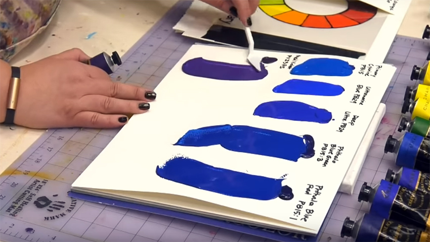
Well, if you haven’t, or if you had it but have long forgotten… Don’t sweat the small stuff! Jerry’s is here to help. Perhaps you have had a class, but still don’t know what a pigment number is and what that could mean for color mixing– this episode may even help YOU!
Tune in and let Amy increase your color knowledge, that can then be applied to all painting media!
Jerry’s LIVE Episode #88 – Color Theory 101 – Basic Mixing, Tips & Tricks
Supply List For: Jerry’s Live – Color Theory 101 – Basic Mixing, Tips & Tricks For Artists!
Here’s an interesting aspect of color theory that is not commonly discussed:
Simultaneous Contrast: Simultaneous contrast is an optical phenomenon that occurs when two different colors are placed side by side, causing each color to affect the perception of the other. When two colors with contrasting properties are placed next to each other, they can appear more vibrant or intensified compared to when they are viewed in isolation.
The effect of simultaneous contrast is due to the way our eyes and brain process visual information. Our visual system automatically tries to compensate for the influence of adjacent colors, leading to a perceived shift in the appearance of the colors themselves.
For example, if you place a small patch of gray on a white background, the gray will appear darker than if it were placed on a black background. Similarly, a red patch of color will appear more intense when placed on a green background compared to a neutral gray background.
Artists and designers often take advantage of simultaneous contrast to create visual impact in their compositions. They can strategically use color combinations to make certain elements appear more vivid, or they can manipulate the perceived value or saturation of colors by adjusting the surrounding context.
Simultaneous contrast is an intriguing phenomenon that highlights the complex ways in which our perception of color can be influenced by surrounding colors, adding another layer of depth to the study and understanding of color theory.
Useful Tools For Choosing Colors
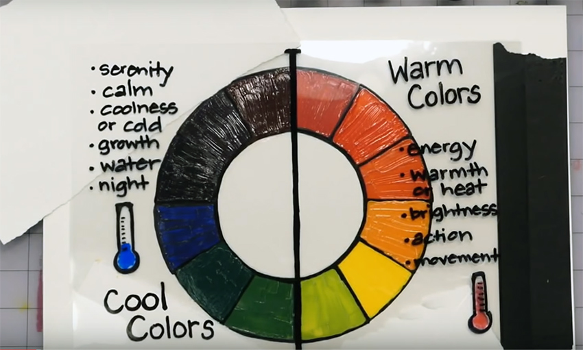
Color Wheels and Mixing Guides
Color Wheel: The color wheel is a circular representation of colors, arranged in a specific order. It is often divided into primary, secondary, and tertiary colors. The primary colors are red, blue, and yellow, which cannot be created by mixing other colors.
Secondary colors are formed by mixing two primary colors (e.g., orange, green, and purple). Tertiary colors are created by mixing a primary color with a neighboring secondary color.
A color mixing guide is a tool or reference material that helps artists, designers, or anyone working with colors understand how to mix different colors to achieve desired hues, shades, and tones. It provides guidance on combining primary colors to create secondary and tertiary colors, as well as instructions on achieving specific color variations.
You may also like...
-

Painting with Linseed Oil: What you need to know
In this article with details, information, images and FAQ’s, we will give you a behind the... -

How To Blend Acrylic Paint
Acrylic paint is notorious for its fast drying time. This can be especially difficult for artists... -

How Real Oil Paint Was Made
The Legacy of Traditional Oil Paint Making and Why Tusc & Pine Artists’ Oils are True...