

5 Facts About The Way We See Color
Top 5 Reasons Why Colors Are Absolutely Crazy
We each probably think of colors as pretty simple. There’s red, blue and green and the rest are made from those three right? Well…
Our minds conceptions of colors are all crazy. We see such a spectrum of colors that we have only just begun to understand how our eyes see them. So, here at the blogsquad, we’d like to stop and appreciate all that our eyes do to see the world in such beauty and color and present 5 insane facts about the colors we see.
1. Everyone perceives color differently.
I’m not just talking about the colorblind people who cant see the number in the circle either:
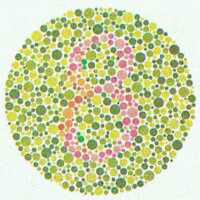
We each see colors differently from everyone else. Colors are simply light reflected and refracted through cones in our eyes so there is no reason that my perception of the color blue might be different from your perception or mind’s definition of the color blue.
2. The color Red is very different to men and women.
Researchers from Arizona State University discovered that there is a unique gene that allows humans to see and decipher the color red. It turns out that the gene needed to see the color red is on the X chromosome. Since it turns out that women have 2 X chromosomes, Women can see different shades of certain colors such as red better than men. Where a man might only see the color red, women are better able to identify shades like maraschino, cayenne, crimson or maroon. That might be why we as men are so bad about picking out your shade of lipstick, ladies…
3. Pink has amazing calming powers.
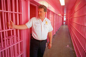
Pink has an amazing power to weaken and calm you down. For awhile, it was legal for football teams to paint the opposing team’s locker room a shade of pink, called Baker Miller Pink, that calmed down opposing players so much, that the home teams were constantly winning. Baker Miller Pink is also called “drunk tank” pink because it can calm down violent prisoners in jails and has often been used as the wall paint color for solitary confinement. It is such an energy-sapping color that the heart muscles can’t race fast enough to get aggressive or angry while looking at the color. It has such an effect, that even color blind individuals will be calmed by that shade of pink.
4. The color Blue has been known to stop suicide
This one is really crazy. Back in the early 2000s, Japan had seen a ridiculous rise in the suicide rate in their country. In 2003 alone, Japan had a record number of 34,427 deaths due to suicide. The suicide trend had people choosing to end their lives by jumping in front of trains for some reason. This form of suicide was especially bad at Gumyogi Station in Yokohama. Tons of people were going out of their way to kill themselves specifically at this one train station. It was getting so crazy that japan had to do something about it so Keihin Electric Express Railway Co. changed the colors of eight lights on the ends of their platforms and the suicides suddenly stopped.
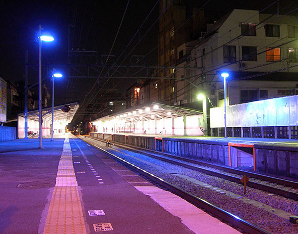
They stopped completely. The substitution of blue lights for the lights that were previously red. But the calming effects of the blue lights stopped that mode of suicide to the point that by the following year, there hadn’t been a single suicide at that train station.
Blue LED lights have also been used in street lamps to shut down crime in high crime areas. It turns out that in addition to being a “calmer” color, because the color is so new and unusual, it causes people to act more cautiously as the blue LED lights remind people of a possible police presence.
5. Red and Blue affect your Intelligence
It’s been discovered that the colors red and blue can affect your intelligence while taking tests. Studies show that people taking IQ tests after seeing the color Red do a good deal worse. Since the color red tends to make people feel cautious, seeing the color tends to make test takers more nervous and second guess their decisions.

The color Blue on the other hand tends to inspire creativity so that test takers typically do better during tests that stimulate their creativity. Seeing blue puts people in a more cool and thoughtful state instead of the color red which puts people into a state of more high alert. Red was shown to better help people in situations that involved editing or proofreading because the color makes you more attentive and pay more attention to detail.
Want to learn more about colors?
Color Charts & Mixing Guides are a great instruments to teach you more about the relationships and harmonies between colors, how to see them and how to mix them!
More Resources
- Color Theory 101
- What’s The Difference? Acrylic Paint vs. Acrylic Gouache
- WATERCOLOR LESSONS – Basic Watercolor Painting Skills
- BEGINNING WATERCOLORS – 5 Pro Tips For Beginning Watercolors
- WATERCOLOR PAINTING IDEAS – 10 Simple Watercolor Painting Ideas for Spring
You may also like...
-

Top 20 Celebrity Artists That Paint
In researching for our previous post on celebrity art investors, we came across an amazing array... -

Art Changes Everything “Create Art, Change Everything”
You Accepted Our Challenge And We Proved Art Can Change Everything! “Create Art, Change Everything” by... -

More of the Best of Sidewalk 3D Art
Don’t Fall In….Wait, Actually, You Can’t. More of really amazing 3rd Street art with chalk where...